CommLab
Scarrd
Where Simplicity Meets Raw Emotion
Scarrd reimagines the simplicity of Carrd with an emotional twist. It’s not just a website, it’s a place where users’ feelings take center stage.
Abstract
In a world where most tutorials and templates guide us to create polished, perfect websites, Scarrd dares to challenge this norm. Inspired by the clean and minimalist design of Carrd, Scarrd adds a layer of vulnerability and emotion, which invites users to build not just one-page sites, but spaces that breathe with raw and unfiltered human experiences. Imagine a website that doesn’t just reflect your thoughts but embodies your feelings, where pages are no longer just a design, but canvases for your emotional journey. Scarrd empowers users to explore the intersection of design and emotion by transforming simple web pages into personal and vivid expressions of the self. Welcome to a space where your feelings can break free!
Preview
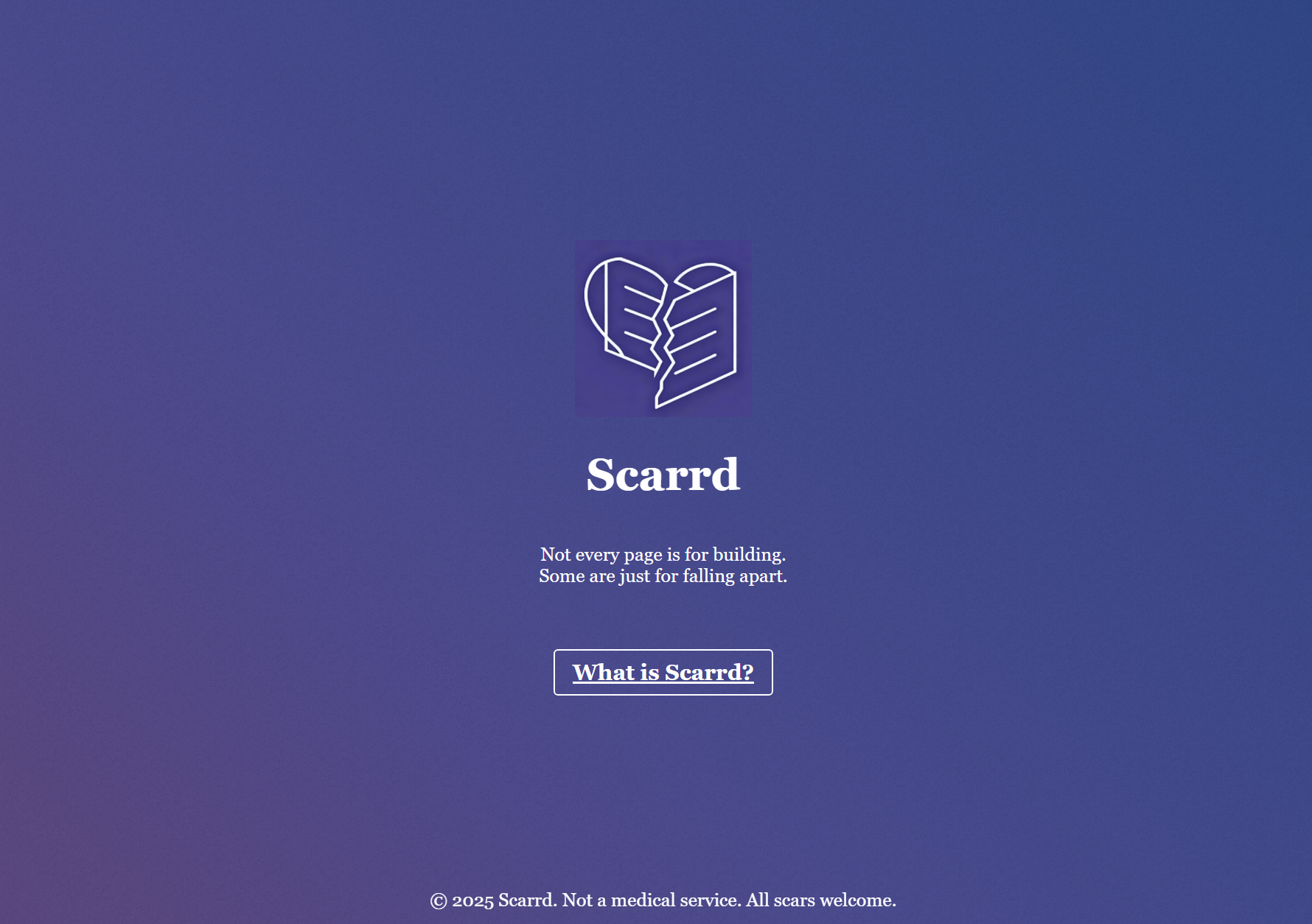
A minimalist design with a story of emotion.
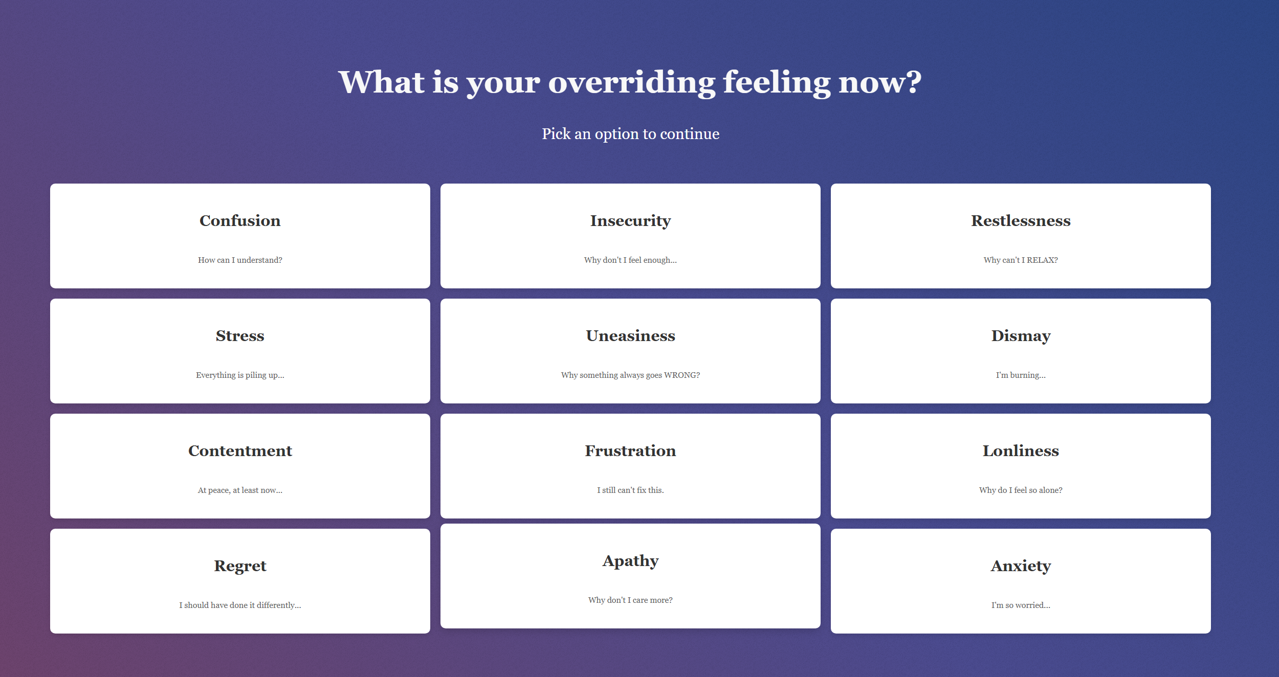
Pick your overriding feeling and tailor solutions for healing!
Design Process and Approach
-
Initial Inspiration
When I first explored Carrd, I was immediately drawn to its minimalist layout, which is both clean and eye-catching. So I decided to adapt the main page structure, especially the layout with an introduction block and a series of characteristic description divs below. The simplicity of the design allowed me to focus on the content, which was important for my concept of emotional damage and healing for Scarrd. -
Borrowed Elements
2.1 Layout:
I used Carrd’s main page framework as a starting point and kept the same general structure of an introductory block followed by a series of feature descriptions in divs.
2.2 Background:
Carrd’s gradient background, particularly the dark, calming colors which align with the emotional healing theme of Scarrd caught my eye and inspired me to use a similar style. The deep hues create a serene atmosphere, which is perfect for reflecting the theme of emotional therapy. So I copied its background image and applied it to my pages.
-
Personalization and Reinterpretation
3.1 Icons and Imagery:
Since Scarrd explores emotional fragmentation, I replaced Carrd’s icon with an AI-generated broken heart shape added onto the original book in Carrd’s icon. The adjusted icon symbolizes the emotional damage and disconnection central to my site’s theme.
3.2 Login Button:
I removed the “Login” button entirely. In Scarrd, I wanted users to be able to express their emotions without the constraints of logging in, which can feel restricting. The idea is to create a space where users can freely share their feelings, while in real life it is difficult to express emotions in a lot of cases.
3.3 Introduction Block:
I took inspiration from Carrd’s horizontal scrolling images after the introduction and used it to compare Carrd and Scarrd. Following advice from Professor Leon, I incorporated Google’s “Did you mean xxx?” feature to highlight the name similarity. I used an AI-generated cracked background to reinforce the theme of emotional breakage.
3.4 Hover Effects:
3.4.1 Inspired by the pictures moving horizontally in Carrd’s introduction block, I used hover effects in the block to emphasize both the emotional shift and the shift from Carrd to Scarrd. If users hover over elements, they will see the picture changing from Carrd in the search engine to Scarrd, which shows the link between the two sites; they will also see the background shifting from complete to fragmented, showing the emotional damage the users might have gone through.
3.4.2 Carrd’s divs in the features section were not interactive, as people can only click the underlined words to get into the subpages. Therefore, I added hover effects onto the divs to showcase the divs are clickable and people can actually enter the subpages by clicking the divs.
3.5 Ways to link to subpages:
Carrd’s divs in the features section, which were not interactive, inspired me to add links to new pages using a different way. I created subpages focused on emotional healing which can be accessed by either clicking the word div or the picture div beside it. The divs in different rows now represent a different emotional healing method, keeping the same layout as Carrd but giving the Scarrd website more interactivity and depth.
3.6 Footer:
I liked Carrd’s “All Rights Reserved” footer, so I added a similar feature. However, instead of just a copyright message, I created a fixed-position footer that reads “All Scars Welcome.” This footer remains visible as users scroll through the page, which symbolizes constant acceptance and reminds users that their emotions are welcome regardless of how broken they may feel.
Use of Visual Principles (Gestalt Theory)
-
Proximity, Similarity and Common Region:
I applied Gestalt principles proximity and similarity to organize content in a meaningful way. The side-by-side arrangement of text and images in the characteristic divs helps users perceive them as related units so that they can click on them and discover the various methods of healing. Also, the similarity in design, to be specific, the same size and hover effect between these divs, together with the design of keeping the divs together in a big container guides the eye smoothly, sends a signal to the user that the divs are all for healing, and encourages a deeper connection with the healing subpages.
-
Continuity:
I also considered the opposite of the continuity principle when creating the about-carrd page as I twisted and color-coded some words in the introduction part to give the user a rough idea about the key concepts of scars and healing I am trying to convey. By doing this, the users might be more willing to go over the paragraph instead of thinking of the text to be too straight, smooth and tedious and just clicking the button below to skip it.
Interaction and User Experience
-
Scrolling:
The scrolling experience on Scarrd represents the emotional process of moving through layers of feelings. The smooth scrolling on the scarrd page invites users to explore the content at their own pace as they can stop to check out the words and the hidden hover effect behind the google picture, while the occasional disruptions like hover effects in the container of the healing section mirror the emotional turbulence that people experience when dealing with their emotions and looking for ways to heal.
-
Linking and Hover Effects:
The addition of clickable links to different, consequential pages makes the site more interactive than Carrd, as for Carrd, there is basically one main page and several subpages for the templates. These links guide users through different emotional healing methods which are diving deeper into their inner world: first explaining their sorrows and worries, then figure out the overrding emotion, after that choose a method to heal, and finally, read some heart-warming quotes to cheer up. Moreover, the links provide a deeper and personalized experience for the people seeking for their heal (though in fact I only created one set of them, the feeling of being taken care of is created). The hover effects also enhance interactivity by shifting the color and position of the divs, which allows users to actively engage with the website and compare the healing methods represented by different pages.
-
Typing:
The simple act of typing in the divs about the unspoken feelings without the message being sent helps the users feel a sense of understanding and secure as they may not be able to find someone to talk to about these feelings in real life or are afraid that these feelings will be peeked by someone else if they write them down physically, which emphasizes the personal nature of healing and self-expression.
Technical Process
-
HTML hierarchy
Basically, I used divs and add words by using p tags, pictures by using img functions and links by using a href functions. And for the pages that requires multiple divs in a certain layout (scarrd and choose page), I created a big div first and then added a lot of small divs inside. To find the divs more easily and avoid confusion when doing CSS, I gave the divs classes and ids according to their positions and meanings to convey. In terms of the naming of the divs, I named the divs in the same page that should be put together with the same class (such as box in the Scarrd page and grid-items in the Choose page), and ids according to their positions (one, two, three, etc) so that they can be differentiated and easily chosen when using CSS for the decoration and layout of the pages.
-
One key CSS moment regarding layout methods
The “two-up” tile layout on the scarrd.html page was the very first technical challenge I encountered, as originally I didn’t know the flex function and just used display:inline-block, width and margin to place the divs. Also, I tried very hard to calculate the margin and the height and width of the divs (by adding the width and padding of the divs) to place the container to make sure that they were the same layout as the original website. At that time the divs seemed to be in the right place when displayed in a small window, two in a row. But when I expanded the window to full screen, the divs were all in a single row. I tried expanding the size of the divs but they still didn’t align. Also, it was very weird that there seemed to be a margin and a color gap at the very right of the page if scrolled to the right(I didn’t figure out why this happened but after using the flex function this was solved.) After learning the flex function in class, I immediately implemented it and it worked. I was very proud of this section as it’s where layout, wrapping, spacing and hover behavior all combine to form the visual grid of the cards’ tiles, which seemed to be better than the original Carrd website. See the code below:
 .container{
 display:flex;
 flex-direction: row;
 flex-wrap: wrap;
 justify-content: space-between;
 align-items: center;
 margin-top: 100px;
}

.box {
 width: 50%;
 height: 480px;
 /* margin: 0 20px 20px 0;  */
 padding: 0 20px;
 border-radius: 8px;
 overflow: hidden;
 box-shadow: 0 4px 12px rgba(0, 0, 0, 0.1);
 transition: transform 0.3s ease;
 position: relative;
 box-sizing: border-box;
}

.box:hover{
 background-color: rgb(187, 54, 127);
}
I found justify-content: space-between to be very important as it distributes remaining space between rows and columns so the two columns spread across the row with even spacing. At first I forgot to use it and the divs were crowded togther. Also, after adding box-sizing: border-box; and padding: 0 20px; it is ensured that padding is included in the width calculation and prevents overflow of the divs which happened before. Also, the layout now can adjust to screen sizes thanks to the width: 50% function of box, as for wide screens it creates a two tiles per row layout and on narrow screens, because flex-wrap: wrap is set, each box will wrap and produce a one-per-row layout once the container can’t accommodate two 50% boxes plus padding.
-
Technical challenges and Compromises
Mostly with the layout of multiple divs as is mentioned above. Problems appeared again in the Choose page and the cheerup page when arranging the multiple divs. In the Choose page, I realized that it was because I forgot to add the paddings so that the divs were crowded together and in the Cheerup page, I realized that it was because I didn’t add the justify-items: center so that no matter how many times I refreshed the page, the divs were all on the left. After double-checking, the problems were solved. Also, when creating the heal page, I initially didn’t know how to create a round button to click on. After searching, I realized that I just had to adjust the border-radius to 50% to make a circle out of a div, which solved my problem. In terms of compromises, I would say it was I didn’t follow the idea of creating templates for people to follow to help them heal their emotional damages because I thought the templates were kind of complicated to create with a lot of buttons and it was too similar to Carrd, which failed to twist the concept of breaking down (this is still building up). Another compromise was that I didn’t know how to make the page grow darker as users scroll down so I didn’t incorporate that in my pages. I thought that it would be more immersive if the page turned darker when the user typed in their sorrows and clicked send and turned brighter when they tried to heal and cheer themselves up.
Reflection and Future Development
The core goal of this project was to adapt the minimalist platform Carrd.co into “Scarrd,” an emotional healing website, and its evolution from proposal to final version depended heavily on feedback and iterative adjustments by my peers and professors. Initially, the project focused only on replicating Carrd’s layout with emotional healing content but lacked context about its connection to Carrd and visual expression of the “brokenness” theme to reflect emotional fragility. After peers and Professor Leon noted confusion about Carrd, I added two introductory pages with a link to the original site to clarify background, while the Learning Assistant’s feedback led me to twist key fonts to highlight the “brokenness” concept. User testing revealed the “Emotion Check” page had excessive text, so I simplified it to direct clickable mood options. Guest critic’s suggestion to remove the “Breathe” page which felt disconnected from core functions—streamlined the user journey was also very constructive and made a lot of sense to me. From my perspective, the project’s greatest strength was its layout, as the Scarrd page had been consistently praised for retaining Carrd’s clean, intuitive grid and visual hierarchy while also integrating healing content, though I’m less satisfied with some of the misalignment between concept and design (for example the irrelevant “Breathe” page which is critiqued by the guest Professor, actually I also had this feeling when creating the page but had no idea of a better solution) and the limited depth of interactive healing tools, as they are mostly typing and clicking to choose without enough actual external sooth. As a result, if I were to redo it, I’d mimic Carrd’s homepage template more closely by filling its modular “div” blocks with concrete healing resources like mood-specific music, affirmation cards, or mindfulness games, and maybe I’d also incorporate more subtle visual metaphors like color transitions from “fractured” to “calmed” tones (similar to Zoey and Emma’s projects) to reinforce the “brokenness” theme beyond just typography. Overall, this project taught me the value of balancing the design of the original platform Carrd for the clarity of purpose twisting its concepts and use its strengths for usability, make every change to achieve the recreated website Scarrd’s healing goal without the restriction of the original website, and incorporate critical feedback from peer users and professors to refine a focused, user-centric tool. Taking my self-reflection and the users’ critiques and suggestions into account, I think my future work will prioritize earlier alignment between concept and design and create more actionable (healing if it’s still to refine this project) features.
Final Thoughts
The process of adapting and reinterpreting Carrd into Scarrd wasn’t just about copying design elements, it was about infusing those elements with meaning and emotion. Every decision from the gradient background to the broken heart icon was intentional, serving to create an emotional space where users could feel accepted and free to express their vulnerabilities. By adding interactivity and rethinking Carrd’s structure, I aimed to enhance the emotional impact of the website and provide users with a more engaging, personal experience.
How to Try It Out
- Visit Scarrd to start building your emotional space.
- Choose a starting point, but don’t just focus on the design. Let your feelings guide you.
- Feel free to express your worries and concerns in the pages and DIY your own Scarrd !
Credits and References
- The twisting of text and the upward-moving of the divs in the choose-your-path page and other transform functions: https://youtu.be/ZSQuEAVEHGs this is actually inspired by a learning assistant who reviews my shitty first draft and told me I could twist and make things move to emphasize the theme of broken & healing
- The hover picture transition from Carrd to Scarrd: inspired by Professor Leon, created via screenshots of the search page of Google: https://www.google.com.hk/
- The editable div in write-to-your-future-self page: https://developer.mozilla.org/zh-CN/docs/Web/HTML/Reference/Global_attributes/contenteditable
- Layout of the choose-your-path page: https://pubnew.paperol.cn/20190519/1558253496zGyJmQ.png which is a lucky-draw page that pops up when I finish doing a survey
- The pictures in this website are all AI-generated with the creator giving the prompt.
About the Creator
Alice Guo
An ENFP and a Communications Lab Web Design Fall 2025 student at NYU Shanghai. As an extremely extroverted and highly feeling-driven individual, she was inspired to create Scarrd—a website that allows raw emotions to take center stage. A complete beginner in web design as she is, this project has been a journey of learning, and she’s excited to keep growing. She hopes users will be patient as she refines her skills and improves the project.
Find more of her work at her GitHub Profile!